Welcome to White Label NFT Marketplace
Scalable and flexible white-label NFT marketplace that any team can launch fast and customize easily.

We designed a White-label NFT marketplace framework powered by Tailwind UI and Thirdweb smart contracts.
Type: Internal product for scaling
Tech stack: Tailwind UI, Thirdweb, smart contract logic
Collaborators: Lead Designer Marinka Krel, Senior UI/UX Designer Bruno Carvalho
My role: UX design, user flows, UI design
Our Goal
We set out to build more than just another NFT marketplace. Our main goal was to create a flexible white-label solution, something that any team could launch fast and customize easily.
We aimed to create a platform that was solid enough to reuse across future client deployments, a developer-friendly system with clean, modular components for seamless handoff and maintenance.
The support of custom branding (from logotypes to theme variants), was also one of our top priorities.
We also focused on simplifying the user experience for creators, collectors, and buyers, especially for listing, bidding and offers.
My Responsibilities
Creating UX wireframes and full-page flows
- Mapping UX to smart contract interactions (e.g. createAuction, makeOffer)
- Writing user scenarios for creators, collectors, and buyers
- Co-designing UI screens (light and dark modes)


The Challenge
Web3 teams want NFT marketplaces, but:
- Custom builds are slow and expensive
- Design consistency across white-labeled platforms is hard to maintain
- Users face poor UX in most crypto marketplaces
Our Approach
To make the marketplace scalable, maintainable, and visually flexible, we focused on a design driven approach that prioritized modularity, clarity, and consistency.
We designed a component based UI system using Tailwind UI as the foundation.
- Created reusable templates for cards, filters, profile sections, and listing flows;
- Focused on layout consistency, hierarchy, and responsive behaviour;
- Built an onboarding flow with clear steps for creating, managing, and exploring digital assets.
Theming & Visual Flexibility
We designed the platform to support custom branding and theming out of the box:
Light and dark mode support built into the UI system
Visual styles structured around adaptable color tokens for future brand variations
Ensured accessibility and contrast compliance across both modes


Use Case Scenarios
To ensure we thoroughly addressed all key user needs, actions, and potential edge cases, I created a comprehensive use case scenario in Confluence, covering over 20 detailed scenarios. Each scenario was structured around real-world user goals, roles, priorities, and outcomes.
For every core action (like connecting a wallet, creating a listing, or making an offer), I documented not only the expected user journey but also alternative and failure paths. For example, what happens when a user forgets their wallet password? Or tries to bid with insufficient funds? Each case was broken down into clear, step-by-step sequences so the entire team, from design to development, could understand the interaction logic and required system behaviour.

User Flows
We created detailed user journeys that mapped out how users interact with the marketplace. The goal was to keep the experience smooth and aligned with how people naturally explore, create, and trade digital assets.
Each flow was designed with clear logic, intuitive steps, and fallback scenarios in mind, covering things like failed transactions and disconnected wallets. This helped ensure the product worked reliably even when things didn’t go perfectly.
Wireframes
Based on the challenges mentioned above, I created detailed wireframes and came up with potential solutions.
This helped us validate navigation logic, page structure, and user flows early, before investing time in visual design. The wireframes helped us spot gaps, simplify steps, and define consistent patterns for things like listings, auctions, and profiles.


Tailwind UI Component System
To speed up development and ensure design consistency, we built the interface using Tailwind UI components as a foundation. We built a variety of components, such as buttons, toggles, inputs, and badges, to make sure the building of the marketplace would be fast and aligned.
These components were not only reusable but also easy to adjust visually for different brands or white-label needs. The screenshot shows a preview of some of the elements we defined and used across the marketplace.

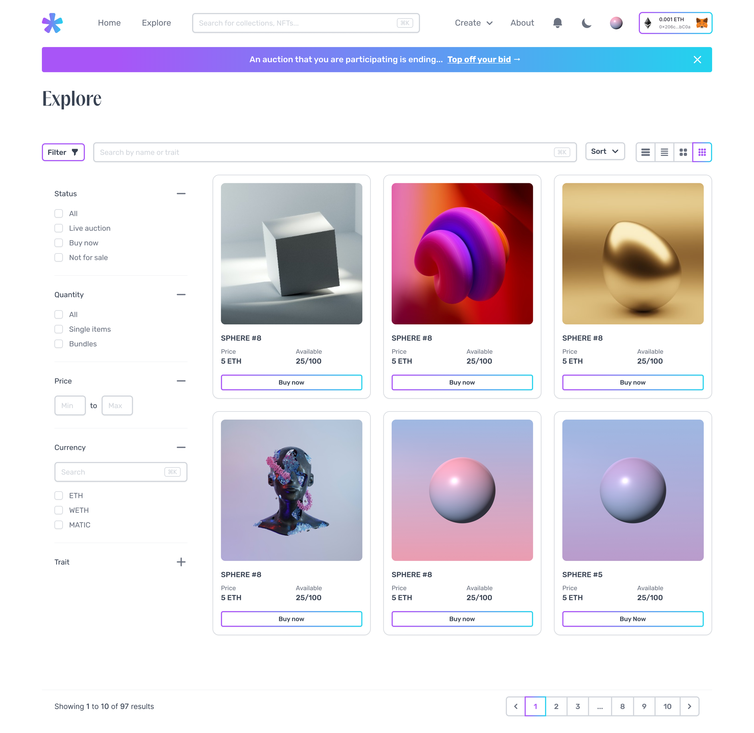
UI Design
Regarding the visual design of the white-label NFT marketplace, we wanted to make it funky, modern and acceptable for both the artists that would mint the artworks, and for the buyers.
From the start, we designed the entire interface in both light and dark modes, making sure the users would experience the product in their own preference. Having both versions helped us maintain high visual standards and also gave us flexibility for future client branding, since this is a white-label product and different clients may have different needs. The goal wasn’t just to invert colors, but to design intentionally for both modes, treating them as first-class experiences.
The color system was structured using Tailwind components classes, which allowed us to create and apply theme tokens efficiently. We included soft gradients, defined elevation styles, and consistent spacing to make the UI feel modern and approachable.


View More of My Work

Holder & Enterprise wallets designed for students and universities, to help them issue, manage, and verify verifiable credentials in a secure, decentralized way
